Making models that're a joy to use

I've been reviewing models, in one way or another, pretty much every day for the past 5 years over at Blend Swap and now for the Blender market. Over that time I've come up with a few tips for making models that are awesome to use. Some of these tips will not relate to all products but the key thing when you're making a model, that others will use, is to make it simple, easy to use, and foolproof. Here are some tips from the last 5 years of model reviews.
Use Constraints for anything that moves.
Constraints make it easy to limit objects from rotating the wrong way or moving too far in one direction. Usually, these constraints can be added and set up quickly, although, some planning is needed to make sure they will work correctly in all situations for your customers. Let's look at a couple of examples of how to use constraints to better your models. As an example, I'm using this Bar Cart created by sizzler. This model is really nice. It's well modeled, has properly named parts, and the thing that really sets it apart is it has constraints already added to the model.
Drawer Constraints
If you take a look at the drawer of the model, you basically have all the parts parented to the handle. If you select the handle you should notice a couple of things: it only moves on one axis and you can't rotate it. This is because it has constraints added to limit the location and the rotation of the drawer. Just like a real drawer, it will go from open to close and that is it. A user of this model doesn't have to worry about how far the drawer will come out or that it will pass through one of the sides or the top of the model because it's already been set up by the author.
Wheel Constraints
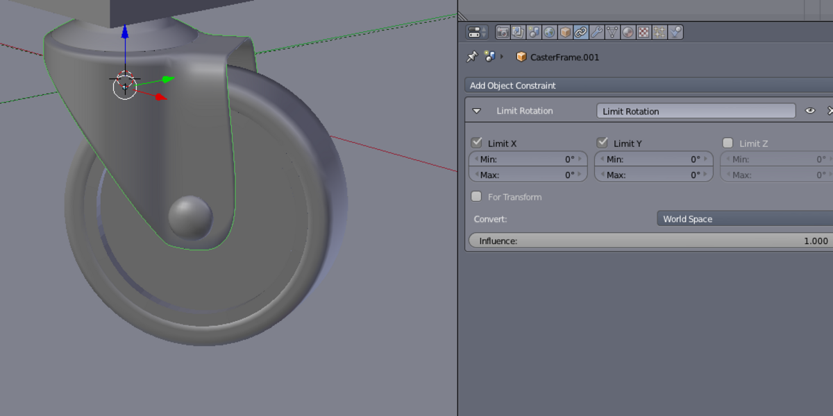
If you take a look at the wheels on the cart you can also see that the maker of the model has added a limit rotation constraint to the wheels. This allows me, as a user of the model, to not worry about trying to animate/pose the wheels and having them rotate off-axis. It's a small thing but, as a user, it really adds an extra value to a model.
Use Empties as Controllers
There are a couple of things about this model that I would change to help improve its usability for a potential customer. Right now the entire cart is parented to the top of the cart. I would enhance the ease of use by adding an empty (perhaps with a cube display) and resizing it to the same size as the cart. additionally, I would parent the cart to the empty. I'd also consider setting a sphere empty offset in front of the drawer handle and using that to control the drawer's position since it's not all that clear that the handle does it.
The above were just a few examples of how constraints (and empties) can help improve your models for other users. The great thing is you can use constraints on anything, from a bar cart to a car model. When creating your next product for the Market, remember to keep the end user in mind and make them a model that is easy to use. They just might love it. Are you unsure about how to use constraints? There are some really nice tutorials about Blender rigging and constraints over at CG Cookie, by author Chris Kuhn.